The Girl with the Dragon Tattoo
I do apologize for the long delay in between posts. It has certainly been a busy month. I started a new job (it's awesome), played some baseball (we lost), and worked on COTN in my spare time (it's vastly improved). I just haven't had the time that I would like to update my blog. So today I write on something that I meant to do a coupled of months ago, a review of The Girl with the Dragon Tattoo.Oh wait, the little one is here.Ok and we're back. Sorry about that but my roommate has his little one this weekend. Three hours and a pocket full of sand later, I'm back to my post. Note to self: playing in a sandy park with little kids with an iPhone in your pocket is not a good idea. However, I did learn that the iPhone can take a fistful of sand without a scratch.Now where was I? Oh yay, that's right the review of The Girl with the Dragon Tattoo. the first part of a trilogy written by Stig Larssen before his death, The Girl with the Dragon Tattoo has been somewhat of a cultural phenomenon, spanning numerous bestselling lists and now three movies. So what did I think of it?Meh.I found the whole story rather generic. It's your boilerplate mystery story with very little to set itself above the crowd. The only interesting thing about the story is Lisbeth Salander. Everytime she shows up, the book kicks in high gear. She's smart, cunning, and darkly funny with an inventiveness that is fun to watch. Unfortunately, she's only in about a third of the book.Yep, that's right. The character whose name graces the cover is not the main character of the story. That honor goes to a financial reporter by the name of Bloomkvist. Who is Bloomkvist you ask? Perhaps one of the most boring character leads that I have ever read. My friend Frederick argues that the lead character in modern novels are designed to be boring as they serve as a cypher for the reader, allowing us to interpolate ourselves into the story. I don't think that's true. A boring character is a boring character. In the case of Bloomkvist, what you get is a middle-aged average-looking man who is inexplicably irresistible to women. What? After a tepid but interesting start, the novel lags badly in the middle sections where it gets distracted from the main plot line and becomes obsessed with the sex life of the boring Bloomkvist. It seems like every women that he comes into contact with falls head over heels in love with him and there's no explanation of why that would be the case. In it's dead middle sections, the novel becomes more enamored with middle-aged male fantasies rather than the mystery that should be the centre of the story. It's really disappointing.Near the end of the novel, when the story focuses more on Salander and the mystery of Harriet"s death, it really picks up steam in a way that many novels would be jealous of. It's great stuff but it should have been like this throughout the entire novel, not just at the end.After reading the Girl with the Dragon Tattoo, I have no inclination to read the next two books in the series. Perhaps if the novels focused on Salander rather than Bloomkvist but even then I would have a difficult time forcing myself to read it. Try Oscar Jade instead, it's a lot more fun.C+
The American Book of the Dead Book Review
While working on my latest draft based on the comments of my editor, Erin Stropes, I decided to check out the last novel that she had edited. "The American Book of the Dead" by Henry Baum was self-published last year and has won a surprisingly number of awards for a self-published title. Henry Baum is also the editor of the Self-Publishing Review and for those of you who remember, recommended Erin to me as an editor based on her work on "American Book of the Dead"."The American Book of the Dead" tells the story of Eugene Myers, a father at the end of his rope, who discovers that the book that he is writing accurately predicts the end of the world. The novel follows his attempts to warn humanity, the apocalypse and the aftermath. In the meantime, Eugene must also deal with his dysfunctional daughter, a disintegrating marriage and a crazy president who believes that he is the messiah.The strongest part of the novel is Baum's writing. Starting with the Douglas Coupland-like opening which straddles bizarre and absurd, the dread of the upcoming apocalypse, the bloody aftermath and the surreal lunacy of the American president, Henry Baum does show that he has some writing skill. Another strength is the uniqueness of the tale. Most stories follow a fairly predictable story arc, Baum on the other hand leads his story down some unpredictable paths. It's great because you never know quite what to expect.That said, there are some glaring weaknesses with the text. Baum's characterization of the president, an obvious joke against George W. Bush, comes off as derivative and uninspired. I did not believe for a second that this individual could become president, or that he would be able to lead America willingly into a suicidal nuclear war. A disastrous war in Iraq, yes, but a world war, not believable. Baum needs the US President to be an idiotic buffoon to start the apocalypse but that is far less interesting than an antagonistic that is smart and cunning.A final weakness with the novel is the ending, which seemingly comes out of nowhere. While I'm not going to describe it here, it does come off as Deus Ex Machina.However despite its flaws, "The American Book of the Dead" is an entertaining read, most due to the excellent prose of Henry Baum. I look forward to reading his next book.
The Name of the Wind Review
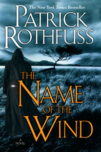 Upon the advice of my co-worker Frederick, I recently read through the novel "The Name of the Wind" by Patrick Rothfuss. In "The Name of the Wind", an old barkeeper by the name of Kvothe recounts the story of his exceptional youth to a passing scribe while a foreboding dark menace closes in on their valley. Given that I spent a couple of months reading through the text, I felt that it might be a good idea to write a review about the novel and the lessons that I draw from it for my own work.The book is the first of a planned trilogy whereas each book takes place during one of the three days that Kvothe has set aside to tell his story. In Day One (The Name of the Wind), Kvothe recounts his idealic youth, the brutal murder of his family, years of poverty, and the beginning of his education as a archanist at the University.Koevthe begins his story to the passing scribe, named the Chronicler, by recounting his idealic youth with his parents on a performing troupe that travels the world. Here the author, Patrick Rothfuss, works very hard and spends many pages establishing the young character of Kvothe, the characters in his life, and how happy and perfect everything is in his life. By this time, we know at something bad is going to happen to Kvothe and we anxiously await its occurrence but Patrick Rothfuss takes an extremely long time in order to get there. This establishes a recurring problem with this novel. When everything goes well for Kvothe, the story drags. When things go badly for Kvothe, the novel soars.Once Kvothe's traveling troupe is murdered and Kvothe is orphaned, the story immediately picks up steam. I was enthralled by Kvothe's struggle for survival: first in the surrounding wood and then later when he moves to a city reminiscent of industrial England. This section evoked the best work of Charles Dicksons and we cheer on young Kvothe as he fights for every last jolt (like a penny).
 After several years of poverty, Kvothe makes his way to the University where he always dreamed of attending. Here he gains admittance through his own inherent brilliance and then wows both students and teachers with amazing feat after incredible adventure after scintillating victory. Once again the novel drags. Some commentators have suggested that this section is more realistic and thus superior to the in-school drama of the Harry Potter series. Unfortunately, I am not able to agree. I found the high school drama in the Harry Potter series (especially in the Goblet of Fire) to be far more engaging then the characters and squabbles that Kvothe encounters. Rowling had this rare gift in creating characters that were extremely easy to visualize and thus remember. After spending twenty hours with Rothfuss' characters, I still can't remember the names of Kvothe's best friends. Kvothe's struggles with his love Denna work much better precisely because Kvothe is eternally frustrated in trying to win her heart. All in all, I found the University section to be slow in tedious precisely because it is too easy for Kvothe to overcome his obstacles.The story picks up again when Kvothe leaves the University to investigate the massacre of a wedding, finds Denna, and then is forced to battle a dragonus (Rothfuss' version of a dragon). This is by far the most exciting part of the novel as Kvothe and Denna are constantly forced to use their wits in order to survive a growing series of obstacles, climaxing with an effective battle with the dragonus in a local village.The Name of the Wind is an enjoyable read but it's biggest weakness is in its structure. There is no single narrative thread that ties the story together. There is the approaching evil but that is saved for the next books in the trilogy. There are some compelling episodes but they don't tie together. Thus we are left without a main storyline. In the Harry Potter series, J.K. Rowling uses a mystery to tie the events within a novel together while giving her the freedom to establish characters and plot lines that carry on from book. The Harry Potter novels stand well alone as individual books. The same cannot be said for The Name of the Wind. Instead it reads as the first part of really long novel, much to it's detriment.In conclusion, the Name of the Wind has some excellent text but is undermined by its lack of a coherent structure.
iBooks Announced for iPhone
 And the good news keeps getting better.As reported by Macworld.com, the iPhone OS 4.0 presentation today announced that the iBooks app, available on the iPad since its launch, will now be available along with the iBooks Store on the iPhone. As quoted by Macworld, this means that
In another borrowed feature from the iPad, Apple will make its iBooks e-reader available to the iPhone in iPhone OS 4.0. The iPhone offering will be a smaller version of the iPad app, but it allows for the same features, including purchasing from Apple’s iBookstore. And you’ll also be able to sync your place and bookmarks between multiple devices—leave off reading a book on your iPad, and you can start reading it in the same place on your iPhone.
It seems that self-publishers in Canada have had nothing but good news over the past three months. First the Amazon Digital Text Platform and Kindle app for iPhone came to Canada in January - allowing any writer to publish to the world's most popular media device at no upfront cost. Then, we found out that Apple was launching iBooks and that Smashwords and Lulu would be supporting it - allowing any reader to buy your work with the same account that they buy music, movies, and games with. But now we find out that iBooks will be available on the iPhone. It doesn't get any better than this. Now only if we could figure out how to get people to buy the millions of self-published novels that will appear on the platform.
Kindle for iPhone Review
As I mentioned in my previous post, the introduction of Amazon's Digital Text Platform and Kindle for iPhone app to Canada dramatically changes my game. Rather than loading it through Smashwords' Meat-Grinder and selling it through an obscure website, I can now sell directly to the iPhone (and apparently the iPad) by simply uploading my story to my Amazon account and choosing my list price. Easy and simple. But if I'm going to publish my stories for the Kindle app, then I better take a moment see how well the Kindle app works. Thus, today I will be reviewing the Kindle for iPhone app.After downloading the Kindle App to my iPhone, I downloaded two books from Amazon's massive Kindle Store: A sample chapter from David Plouffe's The Audacity to Win and Elmore Leonard's Three-Ten to Yuma and Other Stories. Unlike in iTunes, the Kindle store is not integrated into the App. Instead, when you click on the "Get Books" button, it shuts down the app, opens up Safari and takes you directly to the Kindle Store. Once there you can search for the title of your choice.Let's look up No Country for Old Men .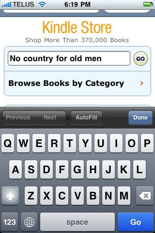 Within a couple of seconds, the search results return. The Kindle edition of No Country for Old Men is right at the top.Clicking on the link takes us to the book's summary page. It gives us a rating, the Kindle price and options to buy and to "Try a Sample".
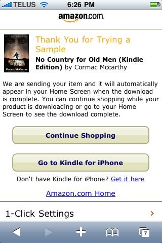
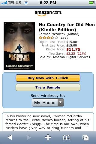 Below, you will find a short blurb followed by customer reviews. It pretty much contains everything that you would want on the screen. Out of Sight and at the very bottom is the useful "Customers Who Bought This Also Bought:" section. If you're publishing to the Kindle Store, it's nice to know that if a reader likes your work that he will have little difficulty in finding your other books. Since I'm not made of money, I'm just going to "Try a Sample". A drop-down menu allows me to send it directly to my iPhone.Once the transaction has gone through, I brought to this screen and given two choices: "Continue Shopping" or "Go to Kindle for iPhone". Let's choose to return to Kindle for iPhone by clicking on the link.
 This choice reopens the Kindle app and automatically updates my library with my new sample book. I can also sort by Recent, Title, and Author if I had lots of books.
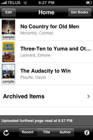 Tapping on the book No Country for Old Men takes me directly into the book. When I first loaded up a text in the Kindle app, there was an option to lock the reading screen into Landscape. Once landscape is locked, I have not found a way inside the app to switch it back to the default option. However, I don't really see this as too much of a problem as I always read in Landscape anyway. One of my pet peeves in E-Readers has been that if I lean to one side, then the screen would flip back to Portrait when I don't want it to. Amazon thankfully has added a pop-up lock option that allows you to lock the screen in either portrait or landscape.
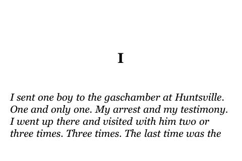 Now reading is very similar to other E-readers, you either swipe or tap on the left or right to move forwards or backwards through the text. The menu gives you options to change the font, view the table of contents, or to synchronize with another device through Whispernet. This allows you to keep your place even if you continually swap back and forth between multiple Kindle-enabled devices. There is also a bar at the bottom of the menu screen that allows you to move back and forth through the manuscript by dragging the bar. With the synchronization of your place through Whispernet, you probably won't need to use this feature but it's a nice feature none the less. One odd quirk is that it doesn't count your place in "pages". Instead, it refers to your "location". The nomenclature is a little unusual but it works fine. Ideally, I would prefer that they be called pages but that's probably just a holdover from my pre-ebook days.As an E-Reader, I would still give the nod to Stanza due to its stronger User Interface but the Kindle app is more than enough to enable to sit back in your bed and read without problems. For most parts, E-Readers don't really need all these bells and whistles. All that matters is the reading experience itself and the Kindle app certainly holds its own. What gives Kindle an advantage over Stanza is that buying books is far more streamlined with the Kindle Store. 3 and 4 clicks and you're the proud owner of a new book. With Stanza, you may have to go through 3 different bookstores to get the book you need. Furthermore, Amazon makes it as easy as possible to buy a book without integrating the Store itself directly into the app. Personally, I would have liked the store integrated directly into the app like iTunes and the upcoming iBook Store but all in all, the Kindle Store works well.